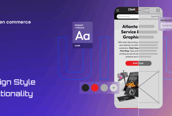
Online shopping has become a standard. With the surge of e-commerce businesses, it is crucial for websites to offer an optimal user experience and interface. An effective e-commerce UI and UX design can make all the difference in turning visitors into loyal customers.
We will explore 5 principles that can help you create an exceptional UI and UX design for your e-commerce website. From focusing on the user interface to using consistent design elements, these principles will guide you towards creating an engaging shopping experience for your customers while boosting conversions!
The Role of UI and UX in E-commerce
UI and UX design is vital in an e-commerce website’s success. The user interface (UI) is the visual elements like buttons, menus, and forms. On the other hand, user experience (UX) creates a positive encounter for customers by improving usability and accessibility.
A well-designed UI and UX can help improve customer engagement on your website. When customers find it easy to navigate without feeling confused, they are more likely to stay longer and make purchases.
effective UI/UX design can also help increase sales conversion rates. By making sure that your website has clear calls-to-action and intuitive navigation paths, you can guide users towards finding what they need quickly while encouraging them to complete their purchases.
Investing time into creating a quality UI/UX design will not only benefit your customers but also boost your business’s bottom line.
Principle #1: Focus on the User Interface
When designing an e-commerce website, focus on user interface. The UI sets the tone of your site and ensures that it is easy for customers to navigate. A well-designed UI can increase conversions, while a poorly designed one can lead to abandonment.
Consistency
One important aspect of focusing on the UI is ensuring the consistency of all elements throughout the site. From colors to typography, users should be able to easily identify each element and understand how they relate to one another.
Simple
Another key principle to UI designs is keeping things simple and intuitive. Users shouldn’t have to decipher how your site works. Cluttered pages with too many options can be overwhelming, so simplicity should always be at the forefront of your mind during development.
Accessibility
Accessibility also plays a significant role in improving your website’s user interface. Make sure that all buttons are clickable by using contrasting colors between texts and background images which enhances users readability when browsing through products pages.
By following these principles for effective e-commerce UI design, you can create a site that not only looks great but functions smoothly as well – ultimately leading towards more sales!
Principle #2: Keep it Simple and Easy to Use
When it comes to e-commerce UI and UX design, keep things simple. Remember that users should always be the center of your design decisions. If your site is difficult to navigate, customers might look elsewhere.
Minimalist Approach
A minimalist approach is one way to make things simple. This means using only essential elements on each page of your website, such as clear product images and descriptions, easy-to-use navigation menus, and prominent calls-to-action.
Reducing Distractions
Another way to simplify the user experience is reducing distractions. Avoid pop-ups or advertisements that might take away from the main purpose of your site – selling products. Keep forms short and straightforward so users don’t get frustrated with lengthy questionnaires.
Helpful Features
Consider implementing helpful features like search bars or chatbots that can quickly answer user questions without requiring them to navigate through multiple pages.
By keeping it simple and easy for users, you’ll create a better e-commerce experience that encourages sales conversions rather than driving customers away.
Principle #3: Use Visuals and Whitespace to Guide the User
Visuals are a powerful tool in e-commerce UX design. They can guide users through the website and create a more engaging experience. However, it’s important to use visuals strategically and purposefully.
Whitespace
One way to use visuals effectively is to incorporate whitespace into the design. This can break up content and make it easier for users to digest information. Whitespace also draws attention to key elements on the page, such as calls-to-action or product images.
Images
Images are another important visual element in UI/UX design. High-quality product images can showcase products in their best light and entice customers to make a purchase. Ensure that images are optimized for web use so they load quickly and don’t slow down the site.
Elements
Icons and other graphical elements can also be used to enhance UX design. These visual cues help users navigate through the site or indicate certain actions, such as adding items to a cart or completing checkout.
Using visuals strategically is an essential part of effective e-commerce UI/UX design. By incorporating whitespace, high-quality images, icons, and other graphical elements into your designs you can create more engaging experiences that guide users towards making purchases on your site.
Principle #4: Use Consistent Design Elements
Consistency is key when it comes to e-commerce UI and UX design. Principle #4 emphasizes the importance of using consistent design elements throughout the website to create a seamless user experience.
Style
Using consistent color schemes, typography, and button styles makes your website look more professional and helps users navigate through the site with ease. When users are familiar with how things function, they can focus on accomplishing tasks instead of figuring out your interface.
Elements
Consistent design elements also help establish brand identity and make it easier for customers to recognize your brand across different platforms. By creating a cohesive visual language that aligns with your brand values and messaging, you can build trust with customers and encourage repeat business.
Creativity
However, consistency doesn’t mean being rigid or boring in design choices. It’s important to strike a balance between creativity and consistency so that you stand out from competitors while still maintaining usability standards. Be creative within established guidelines such as font sizes or layout patterns.
Incorporating consistent design elements into e-commerce UI/UX is essential for building user confidence, establishing brand identity, improving navigation ease for users while fostering creativity in design choices that will keep visitors coming back again!
Principle #5: Test, test, test!
Testing your e-commerce UI and UX design is crucial to its success. Never assume that what is good on paper or screen will work well in real life. Conducting tests with real users can help you identify pain points and areas for improvement.
A/B Testing
You don’t need a huge budget to conduct testing – even simple A/B testing can provide valuable insights into user behavior and preferences. Start by creating two versions of your design with one key difference, then direct half of your traffic to each version and compare the results.
User Feedback
Another effective way to test is through user feedback forms or surveys. Encourage customers to share their thoughts on their experience using your site, including any issues they encountered or suggestions they have for improvements.
Testing is an ongoing process with updates and changes. By constantly refining and improving based on user feedback, you’ll ensure that your website remains effective at driving conversions and generating revenue.
Effective UI and UX design is crucial for e-commerce websites. By focusing on the user interface, keeping it simple, using visuals and whitespace, implementing consistent design elements, and testing thoroughly, you can create an exceptional online shopping experience that will keep your customers coming back.
Remember that designing a successful site takes time and effort. Experiment with designs until you find one that works best for your business. Keep in mind our five principles of effective UI and UX design as you strive to create an engaging online storefront.
By prioritizing your customers’ needs throughout every stage of their shopping journey, you’ll build loyalty among your clientele while driving sales growth over time. So let our excellent developers and designers – Always Open Commerce help you put these principles into practice today – we’re confident they’ll help take your e-commerce business to new heights!


