Product pages are the windows that often ushers online shoppers to make a purchase. Your online store’s product pages play a major role in transforming prospect clients into actual customers.
In the e-commerce industry, there are no sales people that will sell and promote your products and personally persuade shoppers to buy them. But, for e-commerce shops, product pages are built to act as the online or virtual equivalents to human promodisers.
However, product pages are not created equal. While some sell, some don’t. To be considered effective, a product page has to drive actual conversions a.k.a. sales.
In human anatomy, the different body organs and parts are uniquely structured and designed to work effectively for the body. The same goes for effective product pages. The different elements in a product page should work together for lead and sales generation.
So, what makes up an effective e-commerce product page? What are the essential parts that shouldn’t be missed out in designing a product page? Let’s get started.
#1 Clear product descriptions
Besides being clear, specific, and descriptive, product names and descriptions should also be unique especially for SEO purposes. Similar and generic product names will make it difficult for your products to be found through search engines.
You can also include emotional triggers or enticing words and phrases to excite and attract potential shoppers. Move away from typical product descriptions and be creative. Spice them up a bit while retaining the important product details.


#2 Highlighted discounts / savings
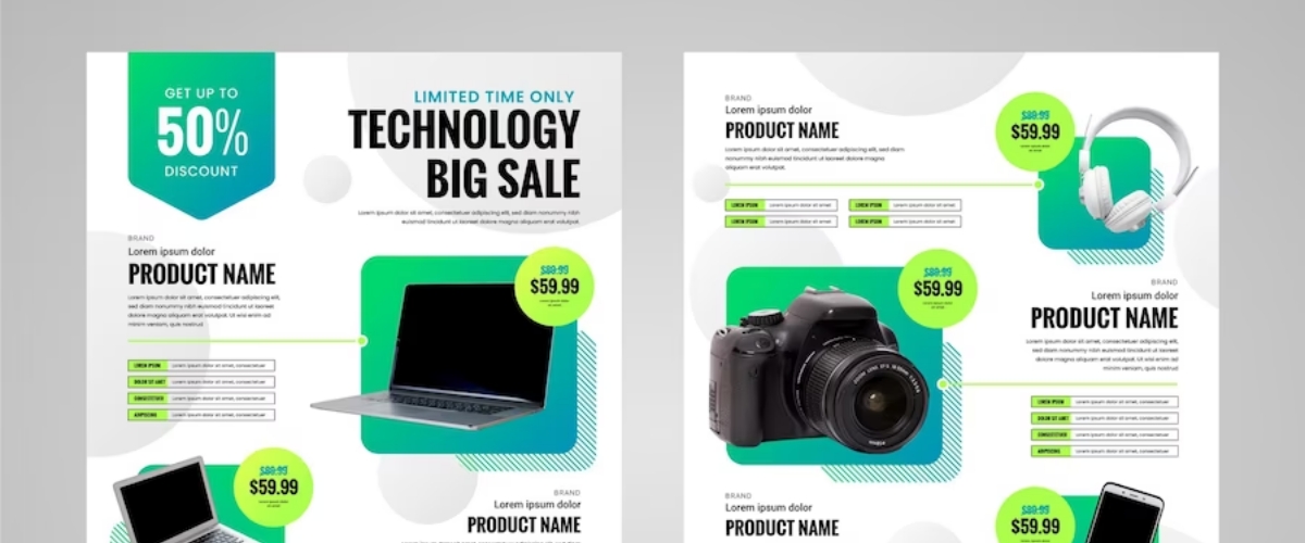
For discounted products, it’s best to capitalize on the amount of money your consumers can save when they purchase that specific product. Show and highlight the product’s original price close to the discounted price. Show them the total savings.
In Psychology, there’s a principle referred to as loss aversion. It refers to the tendency of people to avoid losses than acquire gains. Percentage savings and discounts often entice consumers to make purchases because they don’t want losses.

#3 Top-quality product images
Because we, humans, are naturally visual beings, we process photos faster than texts. So, to appeal to your consumers, you must use high-quality product photos for your product pages. Always use product shots with high resolutions.
According to the results from an A/B testing by Visual Website Optimizer, large product images appeared to beat smaller product images by 9.46% in sales. But, with large images, you need to make sure the image’s loading speed is fast.

#4 Multiple view product shots
In online shopping, shoppers can’t personally touch and hold the products they are interested in. That’s why as an online retailer, you need to create a shopping experience that can make consumers feel as if they’re holding the product in person.
Include multiple view product shots on the single product pages to give the consumers a 360-degree view of their chosen product. Using multiple images shot from different angles offers consumers an opportunity to see your products in full detail.

#5 A strong call-to-action (CTA)
For most product pages of online stores, the “Add to Cart” button is the main call-to-action. To achieve your primary desired response from your consumers, you must create a strong and visible call-to-action content and button. It also has to look clickable.
As any product page’s most essential element, the CTA button should stand out and greatly appeal to the customers. To do that, it has to be instantly visible, colored, bold, large, and clickable. It also has to contrast the rest of the website’s color.

#6 Similar product suggestions
If a prospect customer fails to find the product they’re looking for in your e-commerce store, they’re most likely to leave. But, if you offer them similar product suggestions or related product options, they’re most likely to browse your other offered products.
Adding similar product suggestions is also a sneaky way to promote your other products apart from the product your customer is looking for. Additionally, you can also include add-ons that will greatly complement the product the user is looking into.

#7 Breadcrumb navigation scheme
Breadcrumb navigation is beneficial to both the users and the owners of an e-commerce store. It helps online shoppers retrace the pages they visited before reaching a specific page in your site and makes it easier to browse a collection of products.
Like Hansel and Gretel’s breadcrumb trails, a breadcrumb navigation helps users seamlessly find their way through a website. It complements the primary website navigation by improving usability and UX, showing hierarchy, and reducing bounce rates.

#8 Informative shipping details
One of the leading causes of cart abandonment is shipping fee. To avoid this conversion killer, it’s better to include the shipping fees and details right on the product page and avoid abandoned carts. Be honest and direct to the point regarding shipping rates.
Hidden and additional taxes and shipping charges discovered only upon checkout greatly irritates almost all types of shoppers. Avoid this by showing your customers up front how much exactly they will be paying for a specific product before adding it to the cart.

#9 Customer generated reviews
Reviews and feedbacks from customers positively impacts conversions. According to statistics, customer reviews lift up sales by 18%. More so, 63% of customers have higher possibilities of purchasing from a site with customer-generated reviews.
You can use a tool such as Yotpo to generate reviews and ratings from your users and customers for your e-commerce store. You can also send your customers an email to request for a feedback to ensure user-generated content for your review section.

#10 “Add to Wishlist” option
Adding an “Add to Wishlist” option in your product page can convert to leads when done right. You need to do more than just merely making this option available. You can use your customer’s wishlist items to personalize their shopping experience.
How? Take note of their wishlist items and send out email notifications when the items listed are on sale, or send them related items on sale. You can also offer special discounts for the wishlist items during your customer’s special day i.e. birthday.

“If you don’t sell, it’s not the product that’s wrong; it’s you,” says Estee Lauder. So, if your product pages don’t lead to conversions and sales, there’s got to be something to improve on. Review the anatomy of your present product pages. Experiment. Do tests.
Now that you know the anatomy of an effective product page, you can further improve your existing product pages. Consider and integrate the essential product page elements listed above to attract shoppers, drive conversions, and increase your sales.


