As an owner of an online store, you’re aware of the importance of having a fantastic website. Your website’s layout must be simple to use, visually appealing, and must cater to the requirements of your target audience. Additionally, it should have a contemporary appearance and feel that appeals to modern customers. However, what are the characteristics that define a great e-Commerce website design?
In this article, we’ll go over seven key components of a great e-Commerce website design that you must take into account if you want to ensure that your store stands out ahead of the competition. Taking note of them will definitely help you attract more customers to your site. Let’s get right into it!
7 Essential Elements Of A Great E-commerce Website Design

1. The Header
A well-designed header is one of the core elements of an outstanding e-Commerce website design. Making a solid first impression on your site visitors is important since it’s the first thing they’ll see when they click on your site. Simple navigational links to all of your site’s key pages should be present in your header and it should include your logo and contact details for your visitors to readily contact you.
Aside from being well-designed, your header should be responsive, so that it seems good on all devices. Given that more and more consumers are purchasing on their smartphones and tablets, your site must be mobile-optimized to cater to them.
If you’re not sure where to start with your header design, you can find several tools and templates online. You may design a header that will highlight your e-Commerce site from the competition equipped with originality and your branding.
2. The Hero Section
The hero section is one of the most important components you need to consider when creating a noteworthy e-Commerce website design. This is because, aside from the header, the hero section is frequently the first thing people see when they arrive at your site, so it must provide a positive first impression.
When writing a strong hero section, here are a few things you must keep in mind.
- Keep it straightforward. The hero section should be brief and direct. There shouldn’t be too much text or imagery on it.
- Use high-quality visuals. To draw visitors in and keep them interested, use high-quality visuals in your hero section.
- Make use of persuasive writing. The text in your hero section should persuade visitors to study your products and services by staying on your site.
- Incorporate a call-to-action. Your hero section should contain a compelling call-to-action that will nudge readers to take the next action, such as subscribing to your newsletter or making a purchase.
3. The Product Images and Descriptions
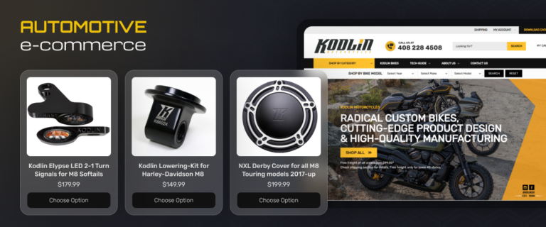
Aside from the header and the hero section, the primary components that comprise any e-Commerce website design are product images and descriptions. After all, they’re what aid in the sale of your goods. What, therefore, makes for excellent product images and descriptions? Here are some things to remember.
- Use crisp, sharp photos to showcase your products. This one should go without saying. Use professional photography if you can. If not, make sure you take your own high-quality pictures.
- Showcase multiple angles. Most people like to see products from different angles before they make a purchase. Showcase your product from as many perspectives as you can.
- Include close-ups. In addition to general pictures of your products, make sure to include close-ups. This will help potential customers understand the features and appearance of your product more.
- Make the most of your descriptions by writing them clearly and informatively. Your product’s description should provide potential customers with all the information they need to know about your goods, making it easier for them to make a purchase.
4. The Call-To-Action Buttons
Your e-Commerce website’s call-to-action buttons should prominently be displayed and very simple to find. They should strategically be placed on your site, whether at the top, in the middle, or close to the bottom of the page.
The content on the call-to-action buttons needs to be clear and accurate in describing what will happen if the button is pressed. Make them stand out from the rest of your site’s content by embellishing them in distinct colors, shapes, and other striking visual features. In addition, make sure to check that your call-to-action buttons are linked to the proper web pages on your site so that customers can quickly complete the needed actions.
5. The Functionality of the Shopping Cart
A shopping cart that’s easy to use is a requirement for a superb e-Commerce website design. For example, multiple goods should fit in the shopping cart and it should also let the customer adjust the amount of each item and see the overall cost of the purchase. A “check out” button that directs the customer to a secure page where they may enter their payment information should be included in the shopping cart as well.
6. The Process of Checkout
The checkout process of an excellent e-Commerce website design should be quick and easy, taking no longer than a few minutes. The customer should have no trouble locating the item they wish to buy and making the transaction without any issues. In addition, the option to save the customer’s personal and payment information for upcoming purchases should be provided and well-protected.
The “Submit Order” button, which directs the customer to a confirmation page, should be prominently displayed as well. The customer should be provided with their order number, estimated delivery date, and a list of the things they’ve bought on the page.
7. The Footer
Your e-Commerce website’s footer is equally as important as its header. This is because the footer includes all of the essential details that your customers need to be aware of before purchasing from your site. This portion includes your return and shipping policies, contact details, and social media links.
Make sure the links and information in your footer are easy to see and navigate. Don’t forget to include a call-to-action button with clear, simple typefaces, too, so that customers will know what to do next.
Final Thoughts
Knowing the essential elements of what makes a great e-Commerce website design is a key factor to the success of your online store. There’s no doubt that the competition in the online marketplace is heavy, however, a fantastic website design with well-crafted essential elements is what’s going to make your store stand out and attract more customers. For your website design needs, Always Open Commerce is your go-to team to help you achieve an astonishing website design. Shoot us a message and let’s get to work!
