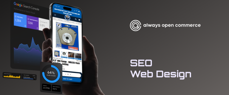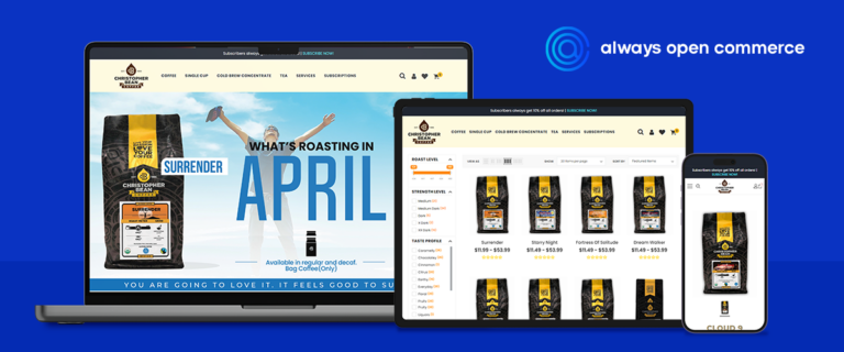



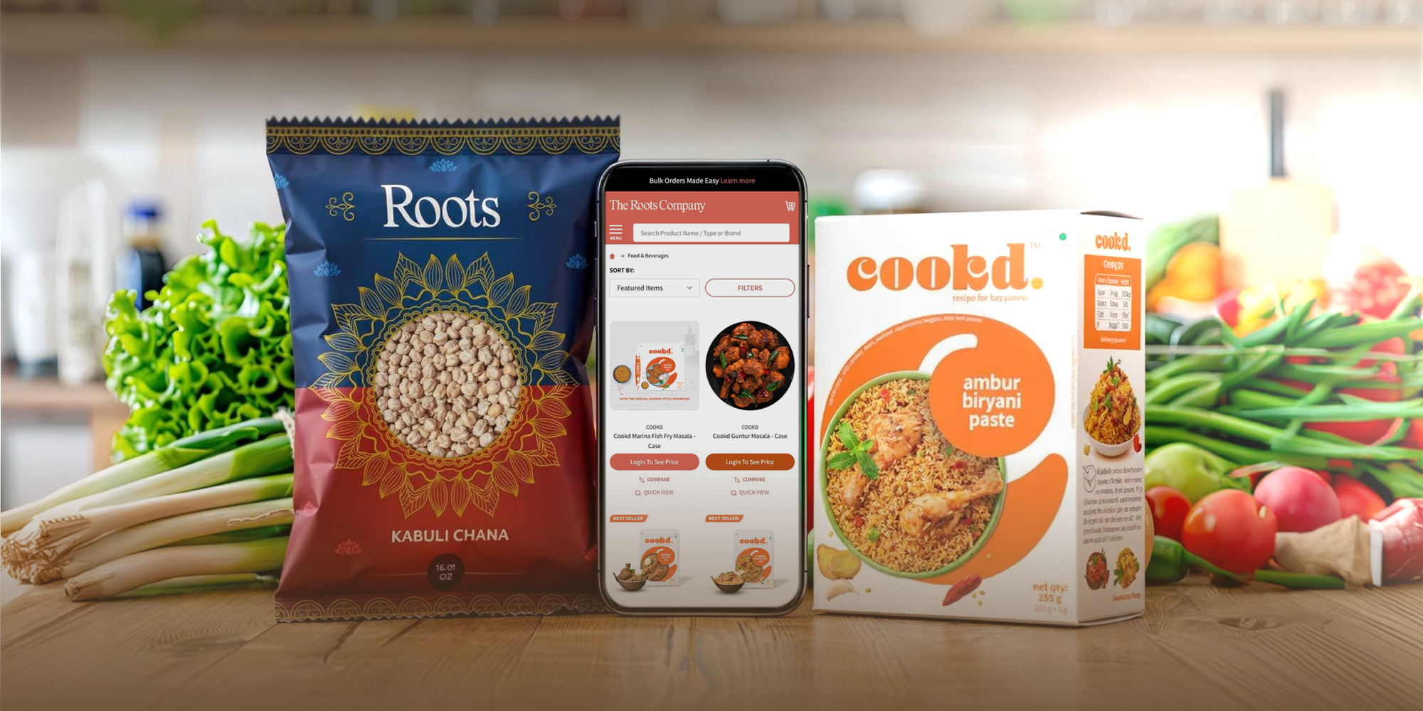








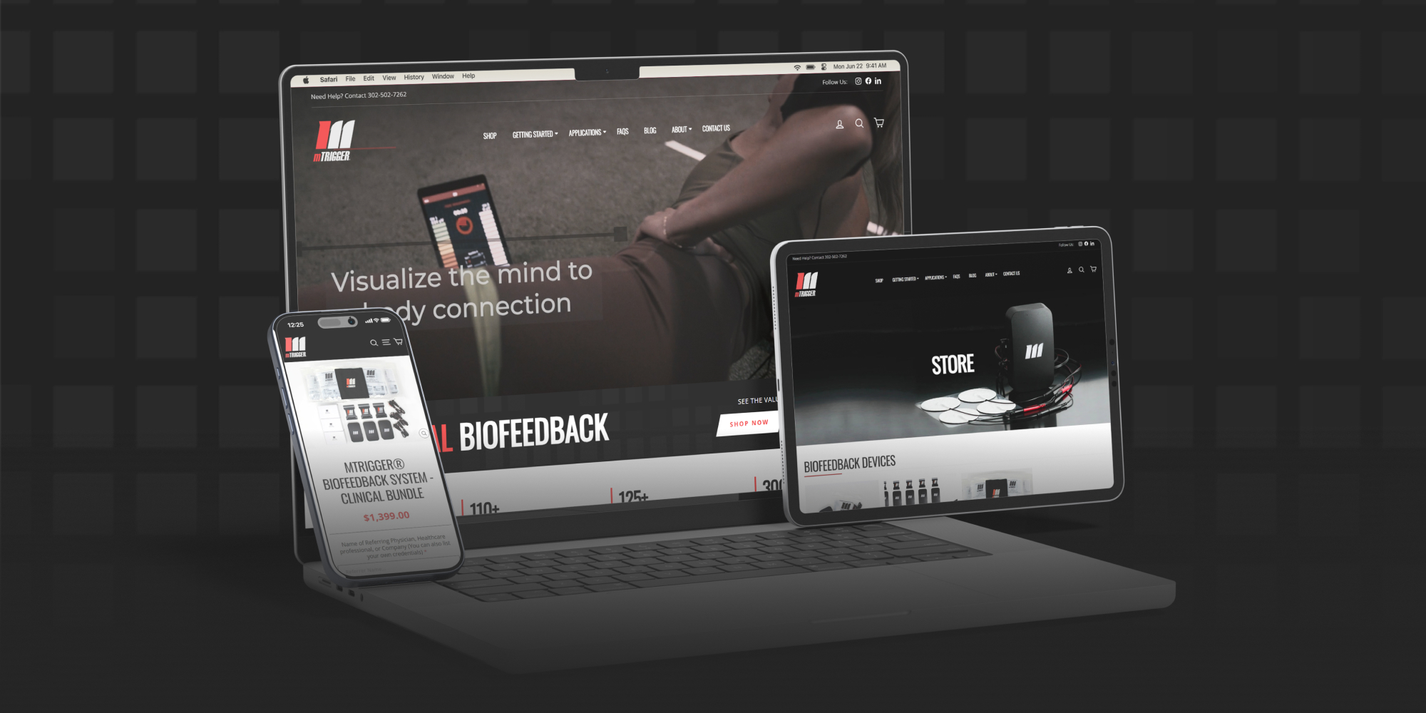







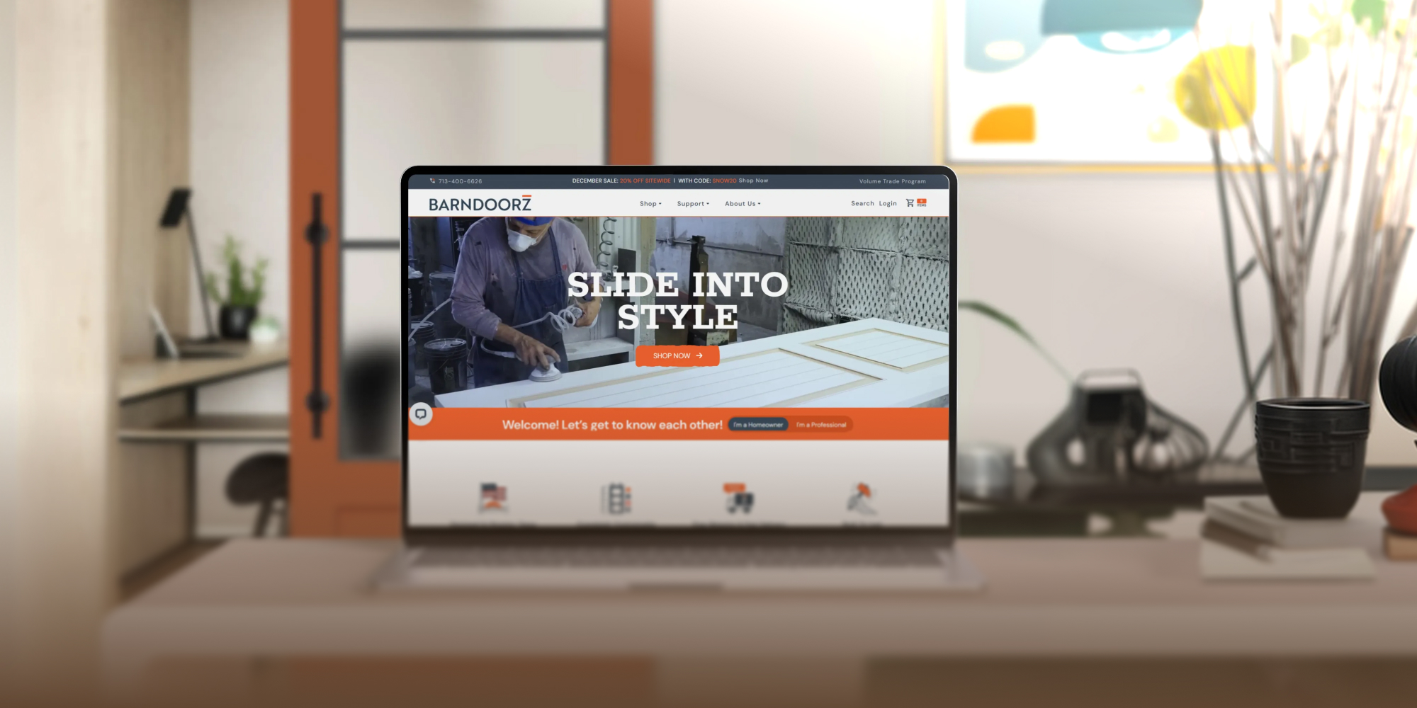









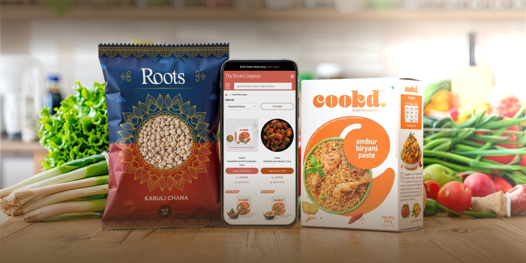



















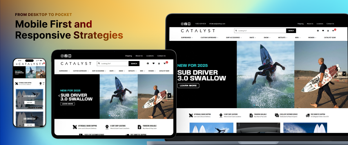

Businesses must adapt to modernized websites with inclusive navigation, meeting users’ changing needs. Always Open Commerce will help you grasp web creation concepts to create an engaging user experience, test the impact, and drive conversions.
Visitors expect to access a fast-loading website with an intuitive navigation and design on all portable devices. A Mobile-first and responsive approach ensures a cohesive browsing experience.
As we navigate mobile technology, observe the meteoric rise in smartphone mobile network subscriptions worldwide, from approximately 2.5 billion in 2016 to over 6 billion by 2023. Looking ahead to forecasts from 2023 to 2028, industry analysts anticipate the statistics to reach nearly 8 billion.

Understanding Mobile First and Responsive Design
The strategic imperative that aligns with the evolving digital engagement. Including mobile screen sizes in design and development planning ensures the user experience remains seamless, intuitive, and optimized for smartphones.
What is Mobile-First?
It prioritizes mobile devices in web development, starting with the smallest screen and prototyping for mobile interfaces. Designers can focus on essential features and streamlined functionality without being overwhelmed by the complexities of larger screens. This challenges designers to simplify and innovate, resonating with inclusive users.
- Simple: Prioritize essential content and strip away superfluous elements that can bog down performance, catering to any device of choice—smartphones and tablets. This ensures swift page load times, helping retain visitors.
- Finger-Friendly: Mobile users navigate primarily with their fingers rather than a stylus or mouse. Engage users with meticulously designed buttons, menus, and interactive features to accommodate touch interactions.
- Minimalistic: Simplicity and functionality remove unnecessary clutter, allowing users to focus on your content. Present a clear, one-way path to guide the eye, improving readability and accessibility for effortless engagement.
A mobile-first design approach creates websites that load faster with an improved user experience and higher conversion rates. Highlight elements like simplified navigation for an effective and enjoyable experience for travelling users.
What is Responsive Design?
An adaptive web experience that matches the contours and sizes of every device users own. Automatically adjust layout and content based on browser space for guaranteed consistent access to vital information across all platforms.
- Flexible: To allow businesses to engage with users across a multitude of devices. Flexible grids and layouts dynamically adapts website elements to the viewer’s screen size, whether on a desktop monitor or a compact smartphone.
- Adaptive: Leverage dynamic adjustments in font sizes and line spacing tailored to screen dimensions for optimal readability. Innovative techniques such as VW (viewport width) units for font sizing preserve proportionality, elevating the visual experience.
- Responsive Images: Visual content remains sharp and proportional wherever users access the digital storefront. Maximize relevant CSS properties to sustain a brand presentation’s aesthetic integrity.
With more people accessing the internet while travelling, responsive design is expected. It provides a consistent user experience across platforms and eliminates the need for separate websites.
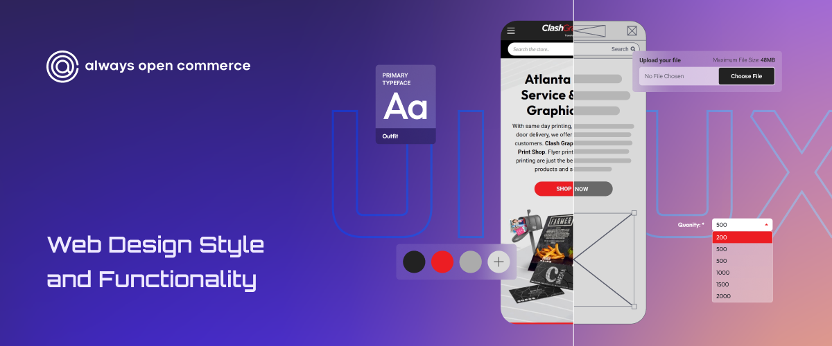
Mobile-First Design Framework for User-Centric Websites
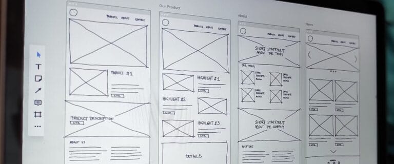
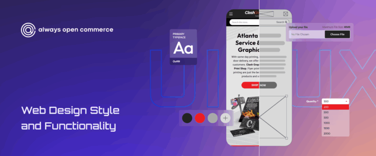
Wireframing is a recommended early step to most efficiently structure your layout. Utilizing the responsive breakpoint menu allows seamless transition through various screen dimensions. This approach ensures that customers receive an optimized viewing experience!
- Digital Assets – Shape robust content strategies prioritizing user experience at every touchpoint. Guide the creation and ongoing maintenance of high-quality, user-centered content across diverse digital platforms for a targeted and consistent brand messaging.
- Visual Hierarchy – Categorize and rank each component based on significance to user engagement and conversion for an intuitive interface. Showcase high-value elements like calls-to-action through strategic use of size, color contrast, and positioning that naturally draws the eye.
- Breakpoint Expansion – Utilize the mobile experience as a foundational element of design. Building the mobile wireframe first ensures that features are tailored to meet user needs in the most accessible context. This is a blueprint for larger breakpoints that guarantee a seamless transition across devices.
- App Mindset – Users now have a keen preference for digital fluidity and interactivity. Enhance usability and cultivate a sense of control for users over their digital journey. Dynamic elements in application design position products to meet and exceed expectations of interactivity and responsiveness.
- Mobile-Friendly Images – Prioritize user experience with a seamless flow of crisp, high-resolution images for handheld devices. This enhances readability and fosters deeper connections with your audience, making every detail accessible.
Enhance engagement and boost retention rates as your audience enjoys a tailored, consistent, and streamlined journey. Build and sculpt user-centric experiences that captivate users at every click, swipe, or tap along the way.
Essential Tools for Modern Designers
Transition your ideas from concept to reality with a suite of tools that cater to every step of the design process. Take advantage of wireframing applications for sketching out user flows and prototyping platforms that create interactive mockups of real-world usage.
- Figma – An environment for designers, developers, and stakeholders to come together in real-time.
- Adobe XD – Use a comprehensive library of customizable assets, leveraging collaboration features.
- Bootstrap – CSS framework specifically for building responsive, mobile-first websites.
- BrowserStack – An unparalleled cross-browser and device testing platform for mobile compatibility.
Redefine your creative process, from intuitive, collaborative graphic design platforms to powerful 3D modeling applications. Streamline your workflow with automation features, saving time while enhancing precision.

Modern Consumer-Centric Qualities
The modern consumer seeks functionality and a seamless experience that resonates with their unique preferences. Businesses must adapt their branding philosophy to prioritize user ease.
Functional White Space
A component in crafting a clean, focused user interface. Prioritizing this design principle achieves remarkable clarity and simplicity within layouts, enabling users to navigate through content seamlessly without unnecessary distractions.
Intuitive Microinteractions
Every click, swipe, and scroll is met with instant feedback that enhances user satisfaction and streamlines the entire experience. Modern interface designs transform mundane tasks into engaging journeys.
Dark Mode
Transcend trends and become a cornerstone of modern digital design. Dark mode reduces eye strain during extended use and in low-light environments.
A mobile-first approach appeals to modern consumers, advocating inclusivity and convenience. Mobile optimization significantly enhances website ranking and ensures seamless performance across all platforms.
Build a Mobile-Optimized Website with Always Open Commerce
The number of mobile users worldwide will increase continuously, and this transformative trend indicates changes in consumer behavior. As such, it becomes imperative to accommodate mobile users, boosting engagement rates and inclusivity.
Build a Mobile-Optimized Website with Always Open Commerce—where our innovative design solutions empower you to meet your customers precisely where they are! Contact Us now!