
An aesthetically appealing website is nothing if it doesn’t attract conversions that lead to sales. A website is not designed to merely look good online – its main purpose is to sell.
An expensive and stunning website design doesn’t offer assurance that your e-commerce website will automatically yield sales conversions. Often, starting business owners allocate too much of their budget on website design aesthetics without putting into consideration a design that actually converts. That’s a great loss of money.
Your e-commerce website is more than just an artwork. It’s not only meant to appeal to customers. It’s designed to encourage engagement that will lead to a successful purchase. As an e-commerce seller, you always keep in mind the sole purpose of your website – to drive sales by converting online visitors into customers.
Web design is more than just the colors or the images placed by designers on your website. It is also comprised of the texts, pages, forms, and the way they are structured. But, it’s another thing to make all these website elements successfully work together to make your website useful, functional, and convenient to use for users.
Your e-commerce site’s web design shouldn’t only satisfy the eyes of your online visitors; it must also give them a comprehensive user experience. How? Here are some e-commerce web design tips to help you create a website that sells:
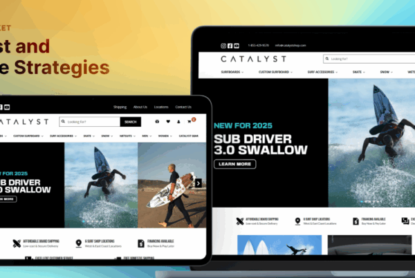
Make a positive first impression through your homepage.
The e-commerce industry is continuously growing. That means you’ll have thousands of online competitors around. That also means you need to make your online store stand out above the rest. Prioritize your homepage. It’s the first thing visitors will see on your website. You can hit or miss your 50-millisecond opportunity to create a positive first impression on your online visitors through your homepage. It only takes that short span of time to make them stay or leave.
Strategically plan the website elements you’ll use on your homepage. The homepage takes the most crucial role in driving visitors to take action – whether it be learning more about your products or services, subscribing to your newsletter, or browsing through your product catalog.
Create a simple yet interactive homepage to give your visitors a unique online experience on their first visit. A free offer or discount banner, explainer video, security seals, logos of partners, search box, live chat widget, and location and phone number are only a few of the elements you can add on your homepage. Also, declaring a “Free Shipping” offer also appeals online shoppers to make a purchase.
However, do not always assume that visitors will turn into customers on their first visit. But, you can make them browse a few or more pages, or come back for more. Bring your best foot forward.
Simplify the checkout process including the forms.
The simpler the processes your customers have to go through while navigating your e-commerce site, the higher their chances of staying. Likewise, make the forms on your website short and direct. Shorter forms perform better in conversions than long forms because they are easier to fill. Ask less and refrain from asking for unnecessary information and they’ll buy more.
Give your customers a smooth user experience (UX) by simplifying the forms and processes in your e-commerce website. You need to make sure that they can get through the checkout process in a swift. If not, your customers may resort to cart abandonment. That’s loss. So, here are some tips you can apply to simplify your e-store’s checkout process:
- For the address entry, try placing the zip code form first in the address entry. From making this information available, an auto fill can generate the values for the city, state, and country – and help customers type in less.
- For returning customers, use or create an algorithmic detection to help speed up their checkout process. As they fill in their email addresses, their records will be automatically looked up and won’t have to fill in some forms.
In whatever strategy you want to employ to simplify your checkout process, just make sure to avoid adding unnecessary forms you won’t actually need from your customers. You can’t risk cart abandonment. Always take note: the simpler, the better.
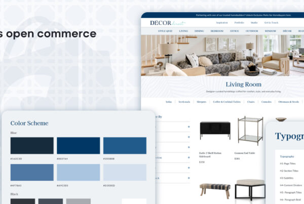
Organize your e-commerce website’s navigation bar.
In a website, the navigation bar is one of the most clicked areas. It’s present on every page. So, you need to make sure that the navigation in your website helps your customers and visitors easily find what they are looking for on your website. A poorly set-up and organized navigation bar often leads to a high bounce rate – one indication of the ineffectiveness of a website.
Position your navigation bar in an area where online visitors expect to see them. More so, you need to seriously determine which links you should include in the menu. Ask yourself this questions:
- “What are the important pages in my e-commerce store?”
- “Are there pages that can be summarized by a main menu?”
- “Can some pages be included in the footer instead?”
- “Does these pages drive business goals?”
- “At which pages do I need to put focus on?”
Because the navigation bar plays a significant role in a website’s UX and usability, it has to be well-thought of. Here are some tips to help you design your website’s winning navigation menu:
- Start with information architecture. Organize the hierarchy of your pages according to their information levels and importance.
- Go for simplicity. Stick to the simple and obvious terms for them to be easily understood by users. The same goes for the design.
- Standardize the navigation for all pages. Make your navigation menu consistent in all your web pages to keep users on track.
Create a clean yet visual and informative product page.
One challenge for e-commerce sellers is to give their customers a personal shopping experience even when they can’t see or touch the products in person. So, you must give them a great product page user experience to positively influence their buying decisions. Below are tips for killer product pages you can test on your e-commerce website:
- Keep it clean. De-clutter your main product page for a minimalistic browsing experience. Leave only the necessary browsing elements such as product search bar, product photos, color variations, and the like. Leave the other details to the product’s individual page.
- Consider loading speed. Slow loading pages breed impatience in potential customers and kill conversion. Refrain from providing your customers an overly designed product page and offer them with a simpler but much responsive one that loads faster instead.
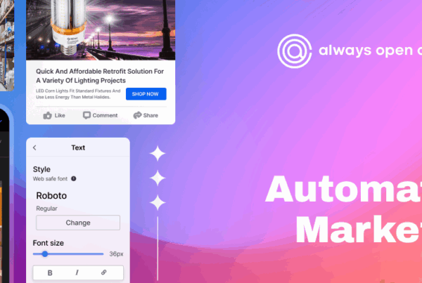
- Invest in good photos. Humans by nature are more attracted to visuals than texts. Invest in only the best photos for your product pages. Give your customers a 360-degree view of your product through photos. Make them feel like they’re seeing the product in person.
- Write top notch copies. With a great product photo paired with a concise and convincing product description, you are most likely to sell. Write a product copy that shows how your product can address the customer’s needs. Highlight product features and use bullets.
- Include options. To make shopping easier for the customers, include options such as color and size availability, related products, and an option to subscribe. By giving them options, they are most likely to complete their purchases without leaving their carts.
- Strategically place CTA. Make sure that the CTA (ex. “Add to Cart”) is instantly visible to get your customers to checkout more easily. Add it right to the product price and highlight it by using a different color. Make sure your CTA grabs attention in a positive way.
Check your website for broken links and images.
A well-designed website is of no use if the images and links aren’t functioning the way they should. Before you officially launch your e-commerce website, test it and get rid of all website errors first – such as broken images and broken links. These web errors will hamper a great UX and result in poor conversion.
To help you get started, here are some effective ways to minimize or eliminate website errors:
- Link suggestions. Readily provide or suggest specific links for users who’ll reach a dead page on your site. A dead page can piss off users.
- 404 Redirect. If the page a user is looking for is dead, this WordPress plugin automatically redirects them to another page within your website.
- Search feature. If users happen to reach an error page, provide them with a search feature that’ll help them search for what they want.
According to statistics, 77% of online users who hit a dead page or link immediately leaves a website. More than that, they are most likely to never return. To avoid these lost opportunities, make sure that all the images and links on your e-commerce site are working.
Lastly, regularly evaluate your e-commerce site’s design.
To maintain the usability and effectiveness of your website, you have to subject it to regular evaluation. Whether your web design may be found effective or not, you need to pinpoint which design element causes it.
To determine which areas users are clicking on your site, you can use the Crazy Egg tool. With this heat mapping tool, you can visualize exactly what your online visitors are doing on your website. Through the heat map data, you can discover which design elements you need to reprioritize or focus more on.
Conclusion
Entering the growing population of the e-commerce industry also opens up to a huge number of competing online stores. But, you can build your own place in this growing industry. To help you stand out, sell among others, and increase your conversions, you can test and mix the e-commerce web design tips listed above. See which of them will work best for your online business.
May the e-commerce odds be ever in your favor!