

A website is a comprehensive space that serves as the first point of contact between a brand and its audience, making a lasting impression on visitors. Users seek more than information—they expect an engaging experience that draws them in.
But what truly makes a website excel is the effortless, delicate balance of style and functionality. Achieving this perfect blend captivates your audience with an easy and smooth navigation through your content. Explore how to harmonize aesthetic appeal with practical usability to create effective websites.
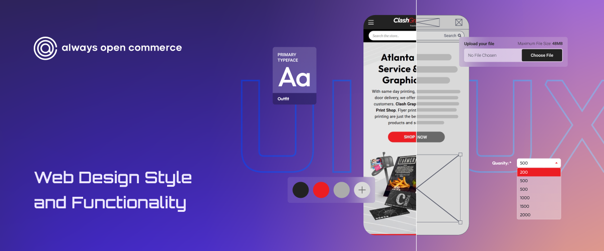
The Balance Between Style and Functionality
If something appears time-consuming or complicated the moment you click, users will likely abandon and look elsewhere. To bridge the gap between aesthetic allure and intuitive interaction, redefine digital products into seamless experiences. Effectively captivate audiences and drive conversions with a fast-loading, immersive journey.
1. Prioritizing Purpose Enhances Design
We see brands enamored by aesthetic allure with visually stunning websites that falter in functionality. The imbalance between form and function leads to frustration and user abandonment. Refocusing redesign efforts on speed and simplicity without sacrificing elegance halves the load time, resulting in a reduction in bounce rates.
2. The Don’t Make Me Think Philosophy
Steve Krug’s “Don’t Make Me Think” embodies a design that makes interactions instinctual, from button placement to menu hierarchy. Users have limited to no patience for confusion, and guessing where to click or hunting for specific information will lead them to search for a smoother experience elsewhere.
- Simple navigation with straightforward and illustrative labels for buttons and menus.
- Reduce mental load with smaller, more manageable task components.
- Conduct regular usability testing to uncover user difficulty points.
3. A Mobile-First Design Mindset
Over 62% of web traffic originates from mobile devices, still excluding tablets. Setting up the mobile design initially ensures that user interactions are smooth from the beginning of a customer’s journey. This positions your brand as a credible, forward-thinker and customer-centric.
- Ensure a responsive design for perfect site functionality on all devices.
- Create decent buttons and links for thumb-friendly navigation.
- Avoid interrupting user experience with excessive and large pop-ups.
Trends come and go like fads, and the fundamentals remain steadfast. Usability exceeds flashiness; clarity beats clutter; speed and accessibility dominate—catalyze significant business outcomes when thoughtful design pairs with smart marketing strategies.
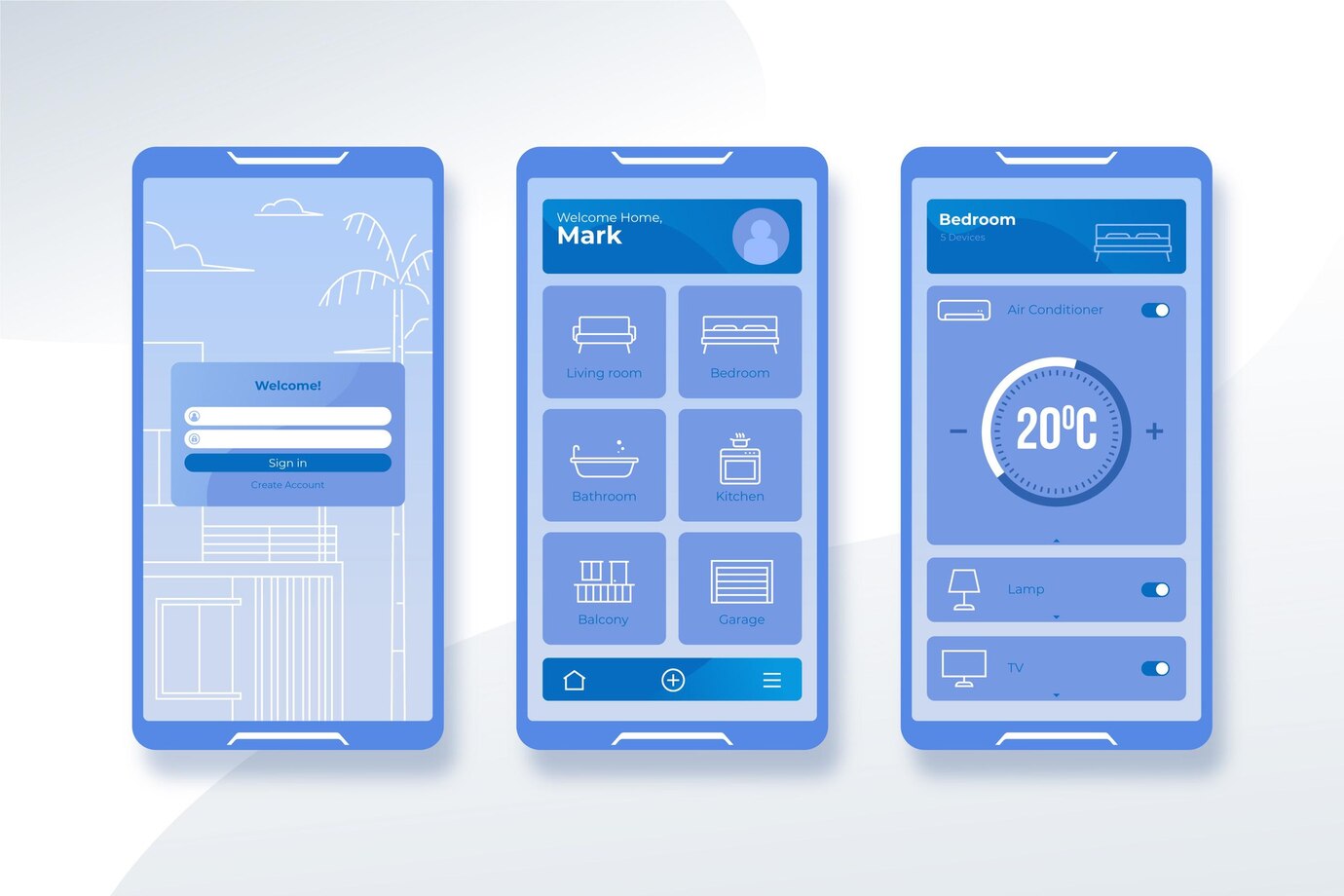
User Experience (UX) and User Interface (UI)
The dual pillars of effective product design for a beautifully crafted app with eye-catching graphics. UI is where aesthetics meet intuitiveness to create an inviting atmosphere for users. The journey encompasses UX, which charts every moment a user spends interacting with your product.
User Interface (UI) design is the strategic orchestration of visual elements that users encounter. It is an interface where each screen is thoughtfully curated to serve distinct user needs, with properly placed buttons and toggles seamlessly guiding them along.
User Experience (UX) maps out every nuance of interaction with your product. It is the understanding of fundamental problems that users face. It prompts critical inquiries into essential features and functions that must be seamlessly integrated to address these needs effectively.
Every pixel in your UI must be meticulously designed to elevate UX; conversely, any oversight in UX strategy can overshadow even exceptional designs. An aesthetic yet functional UI enhances user satisfaction, fostering retention from a purposeful and rewarding experience.
Elements of a Well-Designed Website
Users navigate websites with intuition and expectation, often from established patterns of behavior shaped by their countless digital experiences. A good website design delves from a psychological interplay; each click, hover, or scroll tells us something about what users seek.
- Micro-Interactions with Gentle Animations: Delight users with immediate feedback on their actions, essential for navigation and fostering trust by creating a website that feels alive and responsive.
- AI-Powered Personalization: Showcase products aligned with previous purchases, recommend content based on reading habits, or adjust according to geographical nuances in real time.
- Privacy by Design: Implement a straightforward and innovative cookie-consent system for transparency in what data is collected and how it is managed.
- Reclaim Human Insight: Prioritize authentic human interactions to deliver straightforward, rapid answers to capture customer attention.
- Every Website Needs Dark Mode: Sleek, contemporary aesthetic pairs with practical benefits such as reduced eye strain during prolonged use of screens.
Each element contributes to crafting stylish, streamlined websites that do more than look good. They enhance functionality and speed, ensuring users remain engaged from their first click to conversion. Investing in these foundational components captures user interest and sustains growth.
Tips for Achieving the Perfect Blend
Web design is a nuanced blend of creativity and functionality, where every pixel matters; it’s about looking good while delivering an exceptional user experience. Captivate and flawlessly guide your visitors through content—this harmony can significantly impact engagement and conversion rates.
- Prioritize Content with Headers and Design Elements
Greet visitors with a visually compelling top area that communicates your core message, an invitation to explore further. Strategically place headers that outline main topics for an immediate sense of structure, guiding users through. Coupled with thoughtful color choices and varied element sizes, each visual cue draws the eye toward essential information.
- Hamburger Menus with Clear Link Labels
Elegantly condense your website header to only your logo and a sleek hamburger menu button represented by three stacked horizontal lines. This minimalist design saves screen real estate and invites users to explore. Provide a clean interface where intuitive navigation options are one tap away, with clear and straightforward link labels.
- Pairing Text with Visuals
Leverage the picture superiority effect—an established phenomenon where visuals resonate far more effectively with our cognitive processes than text alone. This synergy simplifies information processing, boosting retention rates among readers. Use vivid infographics or evocative imagery that encapsulates complex ideas at a glance.
Every detail matters, from the strategic layout that guides users to thoughtfully chosen typography and color palettes. Honing the delicate equilibrium between style and function elevates brand presence, creating memorable online experiences that drive conversions.
Style and Functionality in Web Design
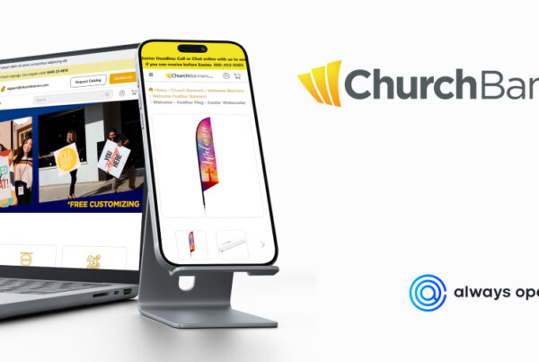
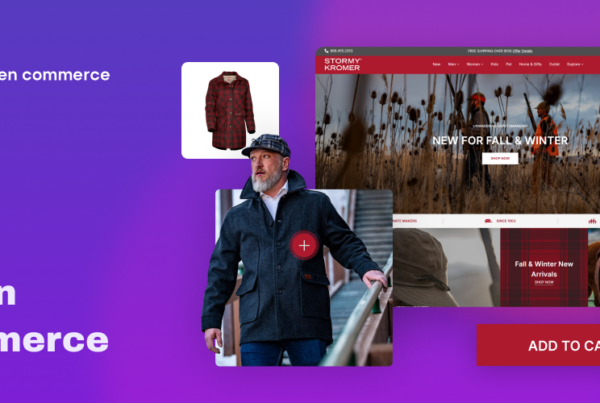
Let the aesthetics capture visitors and the intuitive layout guide them effortlessly from one product to another. This experience is precisely what we aim to create online at Always Open Commerce. We emphasize the innovative blending of visuals that resonate with your brand identity and interactive elements that show a clear path to desired actions. Whether it’s easy navigation menus or responsive features, we tailor our strategies for diverse user engagement.
With our expertise, you’ll enjoy a digital platform where every click counts, driving conversions while fostering loyalty through meaningful engagement. Contact us for a collaboration in building a website that captivates the senses and delivers results!

