






































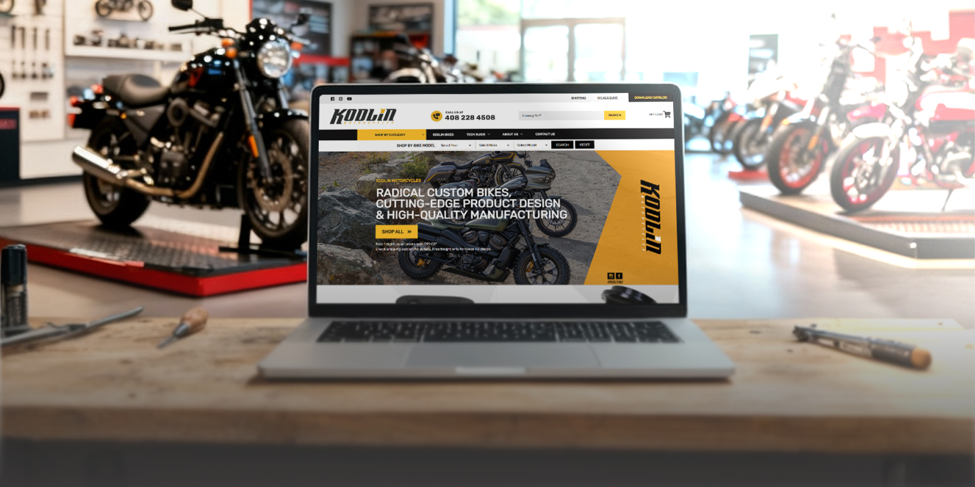







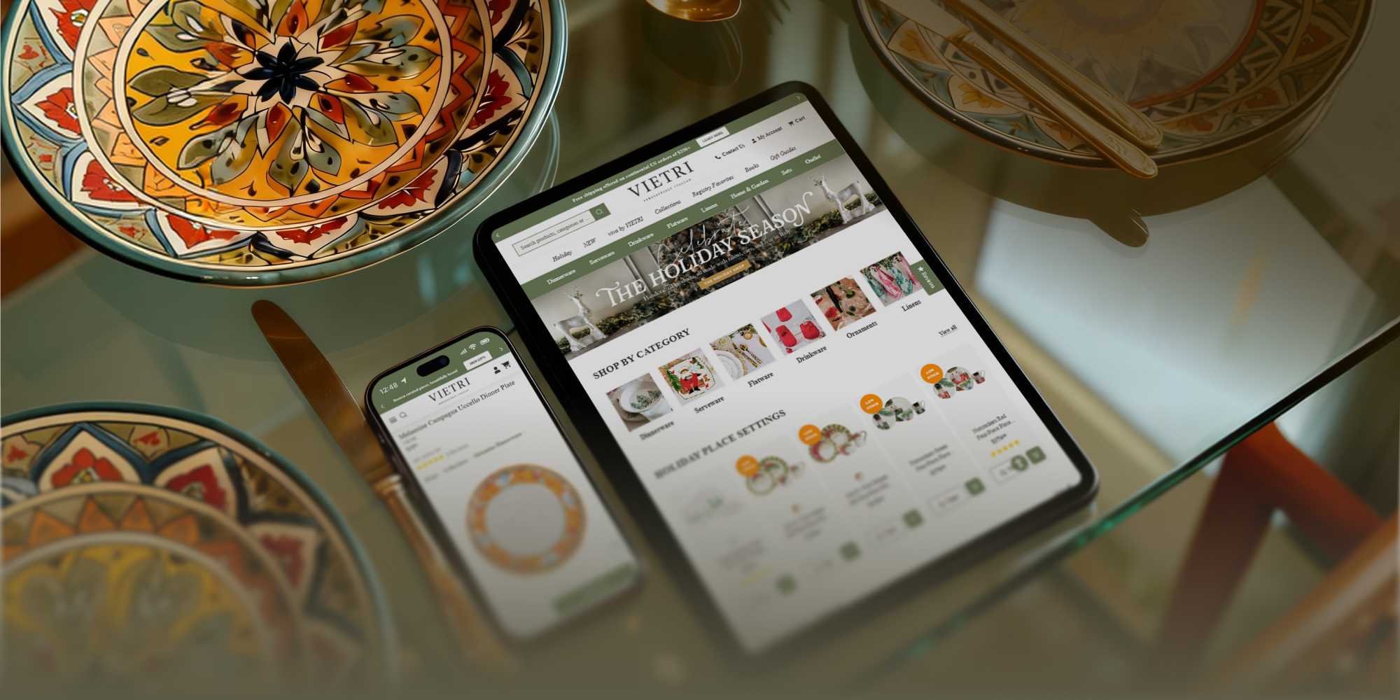





In today’s digital era, having a website that can conform to any device is a requirement. With more people accessing the internet on mobile devices, having a mobile-responsive design has become crucial for websites wanting to remain relevant.
We’ll take a deep dive into how a mobile-responsive design helps reach new heights in terms of user engagement and conversions, and why it is vital for your website’s success. So sit back, relax, and let’s explore why going mobile-friendly should be at the top of your priority list!
What is Mobile-Responsive Design?
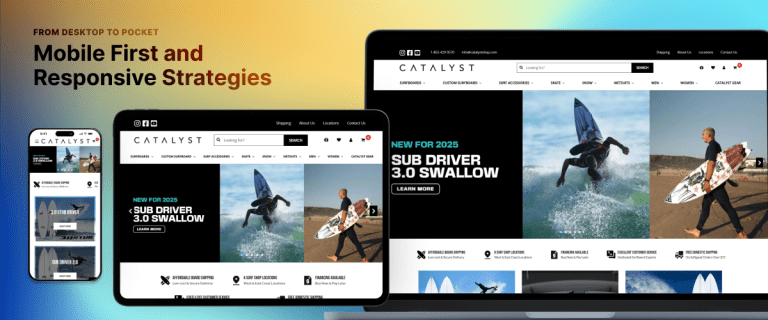
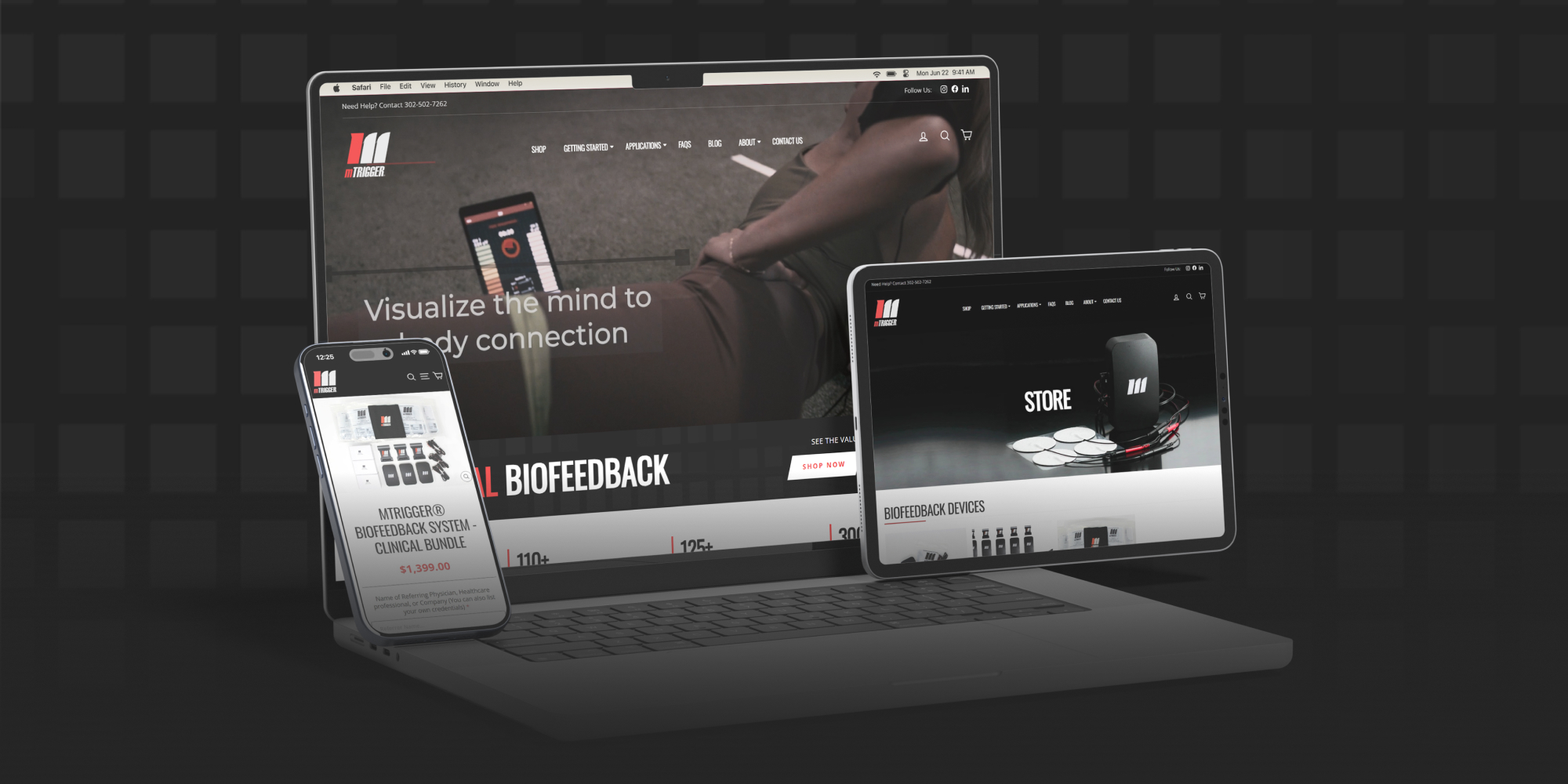
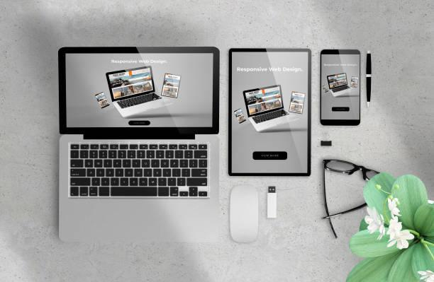
A mobile-responsive design is a website design that is able to adapt to the different screen sizes and resolutions of various mobile devices. This type of design ensures that your website will look great and be easy to use no matter what device your visitors are using.
Mobile-responsive design is important for two main reasons:
- first, because more and more people are using mobile devices to access the internet; and
- second, because search engines now penalize websites that are not mobile-friendly.
If you hope for your website to be successful in the modern day, you need to make sure it has a mobile-responsive design.
The Benefits of a Mobile-Responsive Design
If you’re similar to most people, you’ve certainly noticed that the number of people using mobile devices to browse the web has been steadily increasing over the past few years. In fact, according to a recent report from Comscore, more than 60% of all digital media time is now spent on smartphones and tablets.
This trend is going to carry on, which is why it’s vital for your website to have a mobile-responsive design. A mobile-responsive design is one that automatically adjusts to look great no matter what type of device someone is using to view it.
There are some benefits to having a mobile-responsive design for your website, including:
1. Increased traffic from mobile users: As more and more people use their mobile devices to go online, it is possible to expect an increase in traffic from these users if your site is optimized for them.
2. Better search engine rankings: Google and other search engines favor websites that are mobile-friendly, so you’ll be more likely to rank higher in search results if your site has a responsive design.
3. Improved user experience: A responsive design makes it easy for users to navigate your site on any device, which results in a better overall experience and increased satisfaction.
4. Higher conversion rates: Mobile-responsive sites have been shown to convert at higher rates than those without a responsive design, so you could see an increase in leads or sales if you make the switch.
5. Easier maintenance: With a responsive design, you only have to maintain one site instead of two (or more). This makes it easier to keep your content up-to-date and ensure that everything works properly on all devices.
By investing in a mobile-responsive design for your website, you’ll be able to ensure that your visitors have the best possible experience no matter what type of device they’re using. Not only will this help you stand out from the competition, but it will also lead to increased traffic, better search engine rankings, higher conversion rates, and easier maintenance.
How to Implement a Mobile-Responsive Design
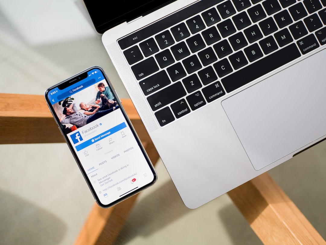
A mobile-responsive design is a must for any website that wants to be successful. Here are four steps to ensure your site is mobile-responsive:
1. Use responsive design principles.
2. Optimize your images and other media for mobile devices.
3. Use a mobile-friendly navigation menu.
4. Test your mobile-responsive design on different devices.
Why You Should Prioritize a Mobile-Responsive Design
If you’re not already prioritizing a mobile-responsive design for your website, you need to start. Here’s why:
1. Mobile traffic is only going to keep increasing. In 2019, over 52% of all web traffic came from mobile devices, and that number is just going to rise in the following years.
2. A mobile-responsive design is essential for good user experience. Users will potentially visit a website repeatedly if they have a positive experience, and it’s less probable for them to convert if they don’t.
3. Mobile-responsive designs are better for SEO. Google ranks websites higher in search results if they’re optimized for mobile devices, so it’s in your best interest to make sure your site is responsive.
4. You’ll lose out on potential customers if you don’t have a mobile-responsive design. If users can’t access your site on their phone or tablet, they’ll likely look for a competitor’s site that functions.
Don’t miss out on potential customers and traffic by not having a mobile-responsive design!
Investing time to create a mobile-responsive design for your website is key to securing its success. With so many people using their phones and tablets daily, it’s essential that websites provide an enjoyable experience on all devices.
You can ensure customers have a great experience every time they visit your website By taking steps to make your site look good and function properly regardless of device type – increasing traffic, sales, and ultimately driving more success for your business.
If you’re looking for someone who can make your website mobile-responsive, Always Open Commerce is the place to go. We have a team of experts who are always up-to-date on the latest trends and technologies, so you can rest assured that your site will be looking its best. Plus, we are always available to answer any questions you may have. So whether you’re a small business just getting started or a large company with an established online presence, Always Open Commerce is the perfect partner for all your web development needs.