




















































Mobile Optimization
Mobile shoppers face smaller screens, touch interactions, compressed layouts, and changing context. The mobile journey deserves its own review. Always Open Commerce evaluates navigation, layout behavior, interaction, and key shopping flows instead of treating mobile as a reduced desktop experience.
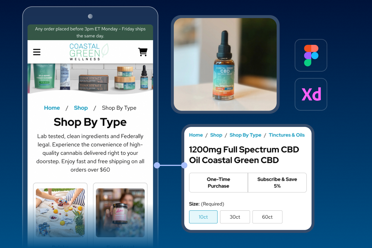

Mobile Should Not Be a Smaller Version of Desktop
A responsive storefront can technically fit on a phone and still be frustrating to use. Menus become deeper, product information competes for limited space, controls sit too close together, sticky elements cover content, and actions that were obvious on desktop can become harder to find or complete.
Mobile Optimization focuses on the experience shoppers actually have on smaller screens. Always Open Commerce can review mobile usability, layout, tap targets, navigation, and page flow to identify where the interface needs to adapt rather than simply shrink. A full redesign or performance-engineering project remains separate unless included in scope.
Navigation, Layout, Tap Targets, and Touch Interactions
The exact work depends on the storefront and the mobile journeys that need attention.

Mobile Navigation & Product Discovery
Review menus, search entry points, category pathways, filters, and other discovery controls so shoppers can move through the catalog without excessive drilling or hidden choices.

Responsive Layout & Content Priority
Adjust the order, spacing, hierarchy, and visibility of content so important information and actions remain understandable within a narrower viewport.

Tap Targets & Interactive Controls
Review buttons, selectors, quantity controls, forms, accordions, and other interactive elements for touch use, spacing, clarity, and predictable feedback.

Product, Cart & Checkout Flow
Examine the mobile path from product evaluation through cart and checkout for avoidable friction, buried information, hard-to-use controls, or disrupted flow.

Cross-Screen Experience Review
Check representative screen sizes and key templates so the storefront adapts intentionally rather than relying on one desktop layout to collapse cleanly everywhere.
Design for Smaller Screens and Touch Constraints
Mobile decisions happen with less visible space and fewer interaction options than desktop. The experience has to establish what deserves attention, what can be progressive, and which controls must stay easy to reach.

What Must Stay Visible?
Important information, primary actions, pricing context, selections, and feedback should not disappear simply because the viewport is smaller.
Where Does the Journey Become Too Deep?
Navigation, filters, categories, account paths, and checkout steps can become harder when mobile structures require too many taps or make it difficult to move back to a broader choice.
Do Overlays or Sticky Elements Get in the Way?
Promotional bars, chat tools, sticky buttons, cookie controls, and app elements can consume a large share of the mobile viewport and interfere with product or checkout content.
Does the Interaction Make Sense for Touch?
Hover behavior, tightly packed controls, small tap areas, and desktop-first interaction patterns may need a different mobile treatment instead of a direct responsive translation.

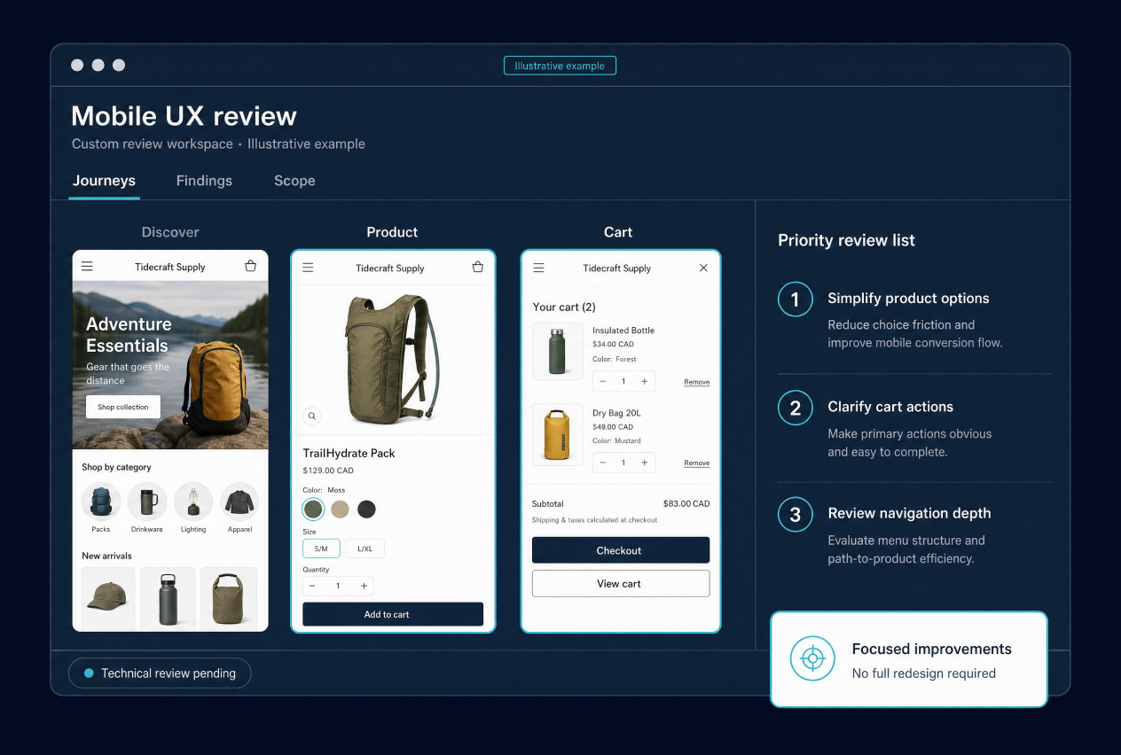
Prioritize the Journeys That Matter Most on Smaller Screens
Mobile Optimization is not a requirement to redesign every screen. The more useful approach is to identify the pages and interactions creating the most meaningful usability problems, improve those experiences, and keep the work connected to the rest of the storefront.
Always Open Commerce can coordinate Mobile Optimization with UX/UI Design, Conversion Rate Optimization, and Custom Development when those services are part of the approved engagement. The service can address usability, layout, navigation, tap targets, and page flow, but it does not automatically include a full redesign or Site Speed Optimization. Technical feasibility and implementation still require appropriate technical review.
Mobile Optimization in Practice
Conversion Rate Optimization
Conversion Rate Optimization
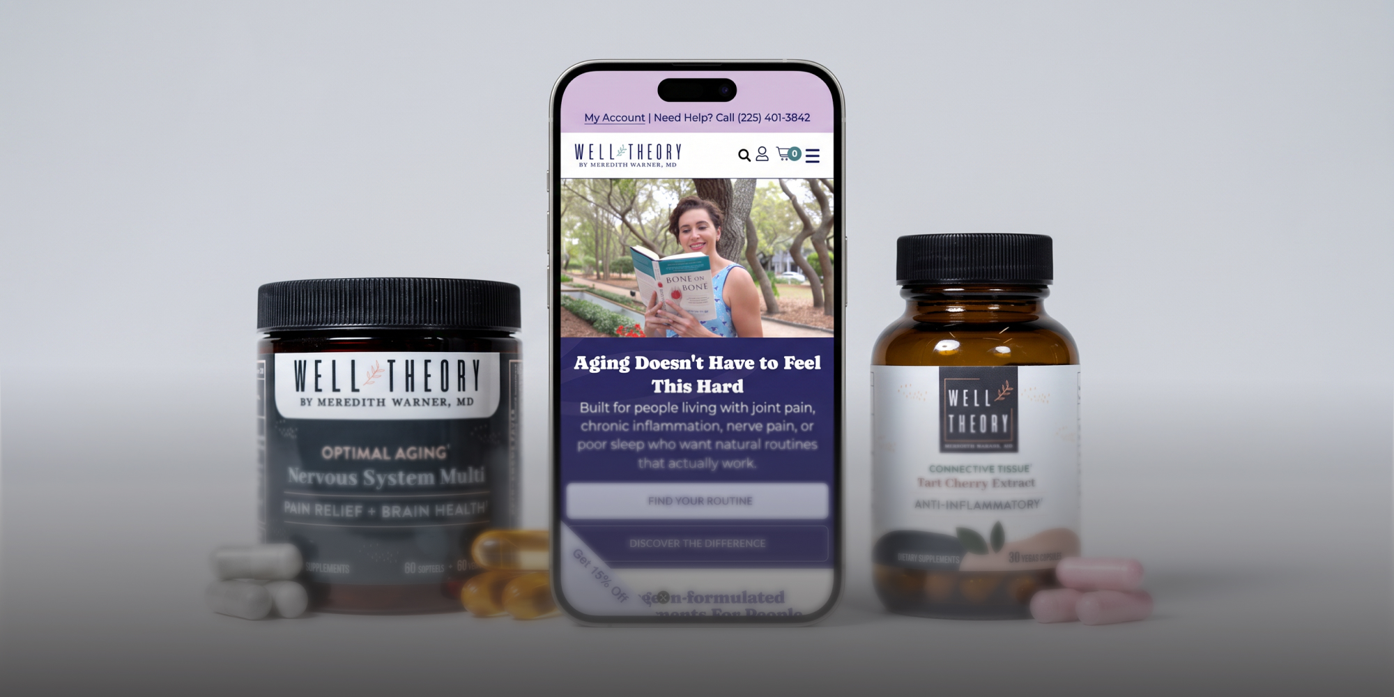
A Smoother WordPress.com Shopping Experience for a Surgeon-Formulated Wellness Brand
UX & Performance Options


Frequently Asked Questions
Mobile Optimization can include reviewing and improving mobile usability, layout, tap targets, navigation, page flow, and key shopping experiences. The exact pages and changes depend on the approved scope.
Responsive design is part of the technical and visual foundation, but Mobile Optimization looks at how the experience actually works on smaller screens. A layout can respond to viewport size and still create mobile usability problems.
Not necessarily. The work can focus on specific templates, navigation, product pages, cart, checkout, forms, or other mobile journeys when a targeted improvement is the better fit.
Not automatically. Mobile performance can affect the experience, but performance engineering and Site Speed Optimization are separate unless they are specifically included in scope.
Sometimes. Mobile navigation often needs a different interaction treatment because there is no hover behavior and less visible space. The exact approach depends on the existing information architecture, theme, platform, and development feasibility.
No. Better mobile usability can remove experience friction, but conversion depends on many factors including traffic, products, pricing, offers, implementation, and measurement. Always Open Commerce does not guarantee a conversion lift.

 USA
USA
 Philippines


